The Art and Emotion of the Brand
Brand Logo Development Process
This is the third of six in a series reviewing the New Zealand Flag re-branding process, a complex year-long project to design a suitably individualistic and nationalistic flag that can pump up the collective New Zealand patriotic fervour. The goal is to have a new flag by April 2016. This is a brand marketing project on steroids and offers a multitude of learning opportunities for both new and veteran marketers and hence very deserving of the attention lavished on it, here. The flag images included here are the final four design options that New Zealanders will vote on in a November / December postal referendum.

The Designers Institute of New Zealand Guidelines[1]
Additional guidelines provided to the people of New Zealand by the panel on the New Zealand government website give five principles of design that can be applied to flags. Much of the same advice can be applied to brand and logo design. Since symbolism is so important both in flag design and ultimately in branding, I have added additional flag descriptive information to complement that provided by the DINZ. The five principles provided are worth repeating here:
1. Simplicity
2. Color
3. The rule of Thirds
4. Symmetry and Asymmetry
5. Context
1. Simplicity –
1. Brand logo / Flag design is an exercise in simplicity: the composition of basic elements in a defined field, a reduced colour palette, and no language.
2. The process should be reductive. It’s as much about what’s not included in a brand logo or flag design as what is.
The flags of Greenland and Japan are cited by the Design Institute of New Zealand (DINZ) as good examples of simplicity:
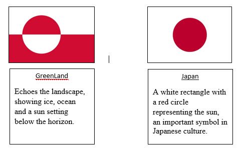
Simplicity is important in Flag and Brand Logo design
Color –
which in the opinion of DINZ is arguably the most evocative element in design as color literally alters how we see the world (More about color and brands below).
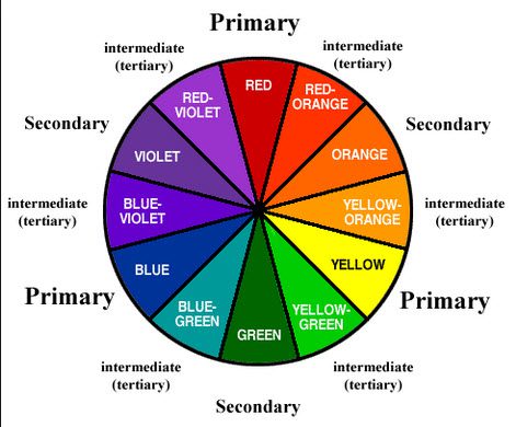
1. As an example from a cultural perspective, yellow signifies divinity in many religions while on an emotional level yellow makes us happy.

Yellow -Happy Brand
2. Many European flags developed their colours from historic traditions and upheavals of the last three centuries.[2],[3]
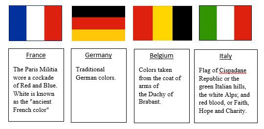
Colors of a historical past
3. In the Australian Aboriginal Flag, the colors are symbolic, representing the sun, the earth and the people.
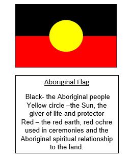
Color Symbolism in the Aboriginal Flag
4. When combining colors, separate light with dark to create contrast. A flag should also work in “grayscale”.
5. The most successful national flags use 2 or 3 colors. More than four can be hard to distinguish.
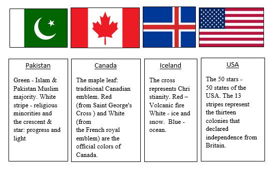
The DINZ prefers two color flags.
6. There are exceptions to this rule, for example, South Africa
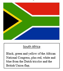
The South African flag is an exception to the DINZ two color rule.
Brand Colors and Brand Emotions
Brand colors evoke certain emotional responses in people and therefore are very important as brand design elements[4]:
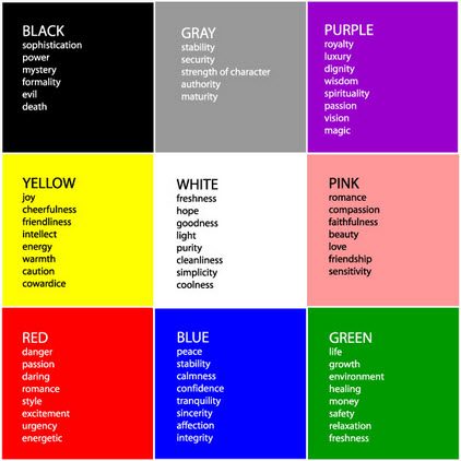
The Meaning of Colors
Linking colors with brands[5]:
Certain colors and their associated emotions have long been associated with certain brands. Thinking of brands that you are familiar with, what colors do they use? Which of your emotions do they evoke? Welcome to the world of color psychology and its impact on brand psychology.
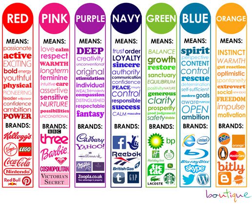
Brands, Colors and Emotions
A few more colors and brands to trigger your emotions[6]
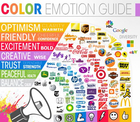
Brands, Colors and Emotions
More Colors, Brands and Emotion
[2]https://en.wikipedia.org/wiki/Flags
[3] http://www.mapsofworld.com/flags
[4] http://www.interiordesignipedia.com/color-meanings.html
[5] http://ideopsychology.com/category/colour-psychology/
[6] https://blog.bufferapp.com/the-science-of-colors-in-marketing-why-is-facebook-blue
