Redesigning NZ Brand logo II-Brand Development Process
Brand Logo Development Process
This is the second of six in a series reviewing the New Zealand Flag re-branding process, a large and often internally divisive year-long project to run a new flag up the flag-pole by April 2016. In commercial organizations of all types and sizes, marketing projects can sometimes be intense and emotional. Usually everybody has an opinion and wants their opinions heard and acted-on but may not be engaged enough in the process to move it forward in a positive manner. This is especially true in projects involving branding, re-branding, positioning, re-positioning or promotional materials. When 4.5 million[1] emotionally invested people are involved (to a greater or lesser degree) some dissent is to be expected and hence has the makings of good marketing case study. The designs featured here are a small sample of the non-qualifiers.
Flag / Brand Consideration Panel / Project team
Marketing has few boundaries within an organization and therefore by its very nature is a very inclusive and consultative process. Marketing initiatives are more successful when they involve cross-functional input and representation from all corners of the organization. Similarly, a cross-functional team has been assembled for what is essentially a large marketing national re-branding project. A Flag Consideration Panel made up of “twelve respected New Zealanders” with representative age, regional, gender and ethnic demographics has been engaged since earlier this year to administer the new flag/ brand logo selection process, and in building public awareness and participation. Of the ~10,300 brand designs received, the final four brand design options suitable for consideration in the November-December referendum were published on Tuesday September 1st.
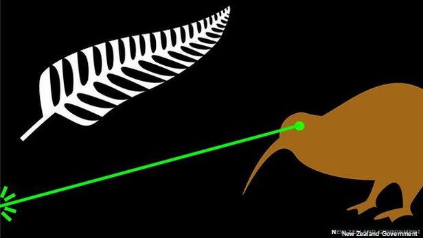
Fire the Lazar! Designed by James Gray, Auckland NZ. “The laser beam projects a powerful image of New Zealand. I believe my design is so powerful it does not need to be discussed.”
The process appears to have been well planned and publicized and remains firmly on schedule but so far (at least according to the New Zealand media), there appears to be less than enthusiastic buy-in from New Zealanders either to the perceived need for a new flag, the flag redesign process itself, or the flag brand design results so far. The jury of the public appears hung up on the flag brand redesign idea in general, and unless a quorum is reached soon, the process may end in March with the current brand flag still hanging over New Zealand. At least, it will be with the blessing of the referendum process. Based on many previous projects that I have worked on, people will get more focused, more engaged and more participative as the process approaches a definitive conclusion. With regards to the process itself, if we ignore the tepid response to date, the staged approach being taken is similar to that which would be taken for any commercial branding project albeit with a much shorter timeline, fewer options, a smaller decision panel but perhaps more internal debate and discussion. Therefore, from a marketing perspective the NZ brand development process is worth a closer look.

Southern Kiwi
by Aku A. (Waikato)
Bird actually is kiwi. Is well known icon of our country and people. Also stars are southern cross and blue is pacific ocean. Where we’re from and how we got here.
The NZ Flag / Brand selection Process is as follows:
✔ Flag /brand design Guidelines published May 15th (Complete)
✔ Public comment period and brand designs submission May 15th – July 16th. (Complete)
✔ Panel selects “long list” of forty brand options published August 10th (Complete)
✔ September 1st 2015 final 4 brand design “shortlist” published. (Complete)
✔ November – December postal referendum.
✔ March 2016 – 2nd postal referendum to decide between current flag and the preferred alternative.
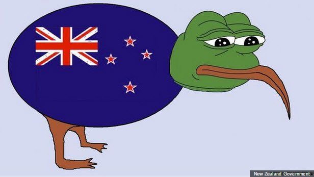
Te Pepe by: David Astil, Waikato
“That feel when our eyes gaze upon the flightless and majestic rare-Kiwi bird is a classic icon of NZ’s deep relationship with our ancestors, their spirit, land and culture. Te Pepe Tamariki, Te Papa Aotearoa.”
New Zealand National “Brand Logo” Selection Criteria:
In an open letter to the people of New Zealand to announce the “40 long-list suggestions” published on August 10th, the panel summarized what it considers to be the criteria to be considered when considering a flag design[2]:
1. A great flag should be distinctive and so simple it can be drawn by a child from memory.
2. A great flag is timeless and communicates swiftly and potently the essence of the country it represents.
3. A flag should carry sufficient dignity to be appropriate for all situations in which New Zealanders might be represented.
4. It should speak to all Kiwis (New Zealand citizens).
“Our hope is that New Zealanders will see themselves reflected in these flags’ symbols, colour (Spelling, ex-US) and stories”.
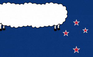
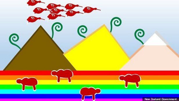
Land of the Long White Sheepcloud by Hamish Duncanson (Bay of Plenty)
“The long white cloud represents our country’s identity — what makes New Zealand special. The sheep’s legs symbolise our endless pursuit to grow as a nation, as we refine New Zealand into a place that we, and the next generations, can be proud to be a part of.”
Vexillography[3]
Internationally accepted principles to guide the design of flags have been developed over time in response to practical issues as well as historical and cultural conventions. Vexillography is the art and practice of designing flags. In particular, this practice responds to practical issues around reproducing the design on cloth and making sure the flag design stands out from a distance and from many angles.
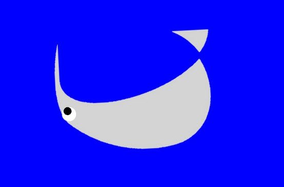
Downunder by J Rapanui (Auckland)
“We’re known as Kiwis around the world which is a great moniker because it captures how friendly and informal we are, so I think the flag should definitely have a Kiwi on it. It’s upside down because we’re from Downunder (which is totally tongue in cheek).”
The basics[4]
Here is a set of common principles to use when developing a flag design. These have been developed to ensure that flag designs stand out from a distance and can be reproduced well in different formats and sizes. While the use of these principles is optional, it is likely they will be taken into account when the flag designs are considered.
1. The design should be simple, uncluttered and balanced.
2. It should be designed to be flown, and viewed from either side.
3. It should look as “timeless” as possible. Avoid using features in the design that will cause the flag to become dated or obsolete. Imagine the flag in a historic setting and in a very modern setting to check whether it would work in both.
4. In terms of colour, using fewer colours will keep the design simple and bold.
5. Contrast is important – use light colours on dark, and vice-versa. So a white cross on red is a good contrast, but a blue cross on red would be a poor contrast. This is a very useful guideline, especially for choosing the colour of any symbols and their background.
6. If the use of non-contrasting colours is unavoidable, make use of outline colours.
7. Any animals or birds would traditionally face the flagpole, so that the animal faces in the same direction as the flag bearer.
8. The top left hand corner of the flag is typically the place of honour in a flag. This reflects the fact that the opposite end of the flag wears out first, and is the section that is least visible when the flag is not fully unfurled.
Gains by Logan Wu (Wellington)
NZ has come a long way since colonialization … the icons are representative of our achievements from the successful implantation of Maori culture in the mountains of the individual cultures that make up our multiculturalism, to the freedom of expression enjoyed by all, including the national pastimes that have replaced the Southern Cross. Choosing a flag that celebrates and recognizes our achievements and forward thinking is one of the most important steps we can take to show the world how we, as kiwis, are off to a flying start.
Which of the final four brand designs would you choose as the NZ brand icon?
Here is an opportunity for you to choose your preference from the four final flag/brand designs.
In the linked-in comment box to this post, list your preference for which of each of the four (4) brand designs below, which you feel best represents New Zealand from your perspective, as follows:
1. First Preference flag/brand
2. Second Preference flag/brand
3. Third Preference flag/brand
4. Fourth Preference flag/brand
If you have the time and the notion, it would be great if you can explain what you like about your preferred brand option and why you feel it best represents New Zealand.
During November and December, New Zealanders will vote in the first postal referendum to decide on their brand preference. The brand design selected will be included in a 2nd referendum in March 2016 to decide between that and the current flag. See how your brand preference as an external stakeholder / customer is reflected in the panel’s selection.
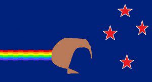
Nyan Kiwi by Fosh (Wellington)
This flag combines the Southern Cross and colour scheme of our existing flag, with the rainbow design of the popular Nyan Cat meme. This design uses the Nyan Kiwi. The kiwi’s colour represents our mixed race society, and its trail represents the colourful variety of cultures present in New Zealand society. The Nyan theme music could also be used as fresh, and simpler, national anthem.
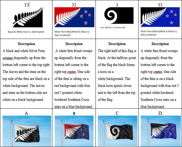
Final Four NZ Flag Designs-Which branding would you choose?
[2] https://www.govt.nz/browse/engaging-with-government/the-nz-flag-your-chance-to-decide/open-letter
[3] https://www.govt.nz/browse/engaging-with-government/the-nz-flag-your-chance-to-decide/resources/flag-design-guidelines/
[4] https://www.govt.nz/browse/engaging-with-government/the-nz-flag-your-chance-to-decide/resources/flag-design-guidelines/